-
[주간학습 정리] Week 3Naver AI Tech 2024. 8. 23. 13:34
이번 주 학습 한 내용 중
인상 깊은 것과 과거에 사용 안 해본 것을 기록하자1. 데이터 문해력을 기르자
- 데이터 문해력이란 데이터를 읽고 이해하고 이를 바탕으로 분석결과를 전달하는 능력이다.
- 데이터 문해력의 핵심 역량 중 하나는 문제를 잘 정의하고 질문을 잘 하는 것이다.
- 좋은 문제해결 접근방법은 문제를 먼저 정의 한 후 그에 맞는 데이터를 수집하여 문제를 해결하는 것이다.
즉, 문제정의와 데이터를 이해하고 분석하는 능력을 기르자!
[Reference: 데이터 리터러시란 | 정의와 역량, 필요성, 활용 방법과 성공 사례]
2. 다양한 데이터 시각화
- 시각화 그래프(차트)는 매우 다양하다.
- 안써본 도구나 방법 등에 대해 알아보자.
- 이 외에도 다양한 그래프가 있으므로 다양한 시각화 자료를 보고 생각하자.
Text vs Annotation
'''
text 와 annotate
특히 annotate를 이용해서 화살표 그리기
'''
fig = plt.figure()
ax = fig.add_subplot(111)
ax.plot([1, 1, 1], label='1')
ax.plot([2, 2, 2], label='2')
ax.plot([3, 3, 3], label='3')

ax.set_title('title')
ax.set_xticks([0, 1, 2])
ax.set_xticklabels(['zero', 'one', 'two'])

ax.text(x=1, y=2.5, s='#1 text')    # text 추가 방법 1
ax.annotate(text='#2 annotate', xy=(1, 1.75))    # text 추가 방법 2
ax.annotate(text='#3 annotate with arrow',
            xy=(1, 1.25),
            xytext=(1, 1.5),
            arrowprops=dict(facecolor='black')
            )    # text 추가 방법 3 + 화살표 추가

ax.legend()
plt.show()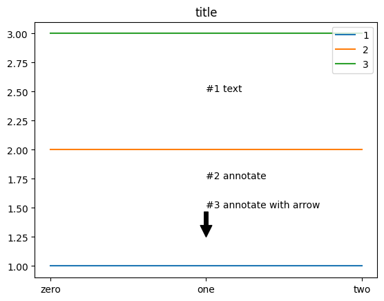
'''
text

- Text Properties and layout
(https://matplotlib.org/stable/users/explain/text/text_props.html)

'''

fig, ax = plt.subplots()
ax.set_xlim(0, 10)
ax.set_ylim(0, 10)

ax.text(x=3, y=6, s='This is \nText',
        fontsize=20,
        fontweight='light',    # normal, bold, heavy, light, ultrabold, ultralight
        fontfamily='monospace',    # serif, sans-serif, cursive, fantasy, monospace
        color='blue',
        linespacing=2,
        va='center', # top, bottom, center
        ha='center', # left, right, center
        rotation='horizontal', # vertical?
        bbox=dict(boxstyle='round', facecolor='gray', alpha=0.4)
       )

ax.annotate(text='This is annotate',
            xy=(4.4, 4.8),
            xytext=(6, 3),
            bbox=dict(boxstyle='round', facecolor='gray', alpha=0.4),
            arrowprops=dict(arrowstyle='->'),
            zorder=10
            )

plt.show()
sharey
'''
bar plot
- sharey

'''
x = list('ABCDE')
y = np.array([1, 2, 3, 4, 5])
clist = ['blue', 'gray', 'gray', 'gray', 'red']
color = 'green'

fig, axes = plt.subplots(1, 2, figsize=(10, 5))
fig.suptitle('color')
axes[0].bar(x, y, color=clist)
axes[1].barh(x, y, color=color)

fig, axes = plt.subplots(1, 2, figsize=(10, 5), sharey=True)    # y label 공유
fig.suptitle('sharey')
axes[0].bar(x, y, color='blue')
axes[1].bar(x, y[::-1], color='red')

plt.show()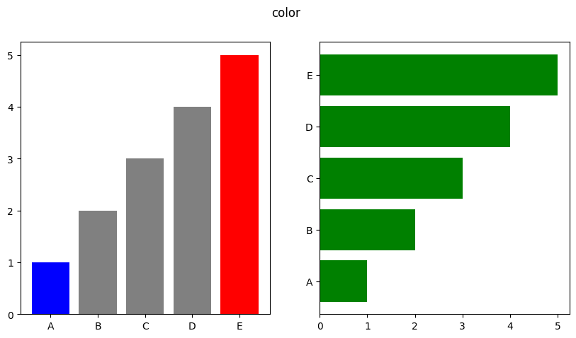
Countplot
'''
Countplot
- 범주를 이산적으로 세서 막대 그래프로 그려주는 함수
- 데이터프레임에서 원하는 열의 각각의 고유한 값의 개수를 세어 그래프로 표현함
'''

sns.countplot(x='race/ethnicity',data=student,
              hue='gender',
              palette='dark:red',
              order=sorted(student['race/ethnicity'].unique())
             )
Violin Plot
'''
Violin Plot
- 흰점이 50%, 중간 막대가 IQR 범위를 의미함
'''

fig, ax = plt.subplots(1,1, figsize=(12, 5))
sns.violinplot(x='math score', data=student, ax=ax,
               bw_method=0.1,
               cut=0,
               hue='gender',
               inner='quartile'
              )
plt.show()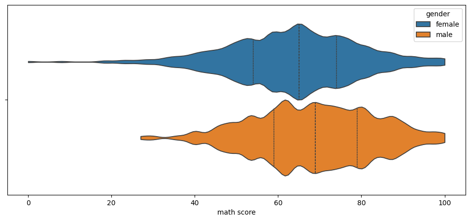
boxen plot, swarm plot, strip plot
'''
boxen plot
swarm plot
strip plot
'''

fig, axes = plt.subplots(3,1, figsize=(10, 15))
sns.boxenplot(x='race/ethnicity', y='math score', data=student, ax=axes[0],
               order=sorted(student['race/ethnicity'].unique()))

sns.swarmplot(x='race/ethnicity', y='math score', data=student, ax=axes[1],
               order=sorted(student['race/ethnicity'].unique()))

sns.stripplot(x='race/ethnicity', y='math score', data=student, ax=axes[2],
               order=sorted(student['race/ethnicity'].unique()))
plt.show()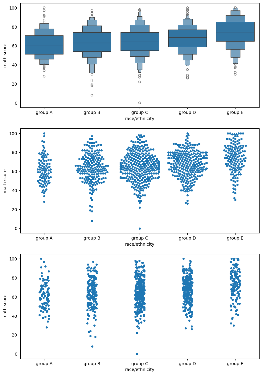
scatter, hist, kde
'''
scatter
hist plot
kde plot
'''

fig, axes = plt.subplots(1,3, figsize=(12, 4))
ax.set_aspect(1)

axes[0].scatter(student['math score'], student['reading score'], alpha=0.2)

sns.histplot(x='math score', y='reading score',
             data=student, ax=axes[1],
             color='orange',
             cbar=False,
             bins=(10, 20),
            )

sns.kdeplot(x='math score', y='reading score',
             data=student, ax=axes[2],
            fill=True,
            )

plt.show()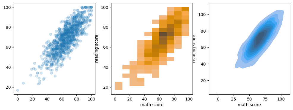
'Naver AI Tech' 카테고리의 다른 글
[주간학습 정리] Week 6 (2) 2024.09.13 [주간학습 정리] Week 5 (1) 2024.09.06 [주간학습 정리] Week4 (0) 2024.08.30 [주간학습 정리] Week 2 (0) 2024.08.16 [주간학습 정리] Week 1 (0) 2024.08.09